2025
Artpilot case study
Artpilot is the digital tool for the people who make the art world work.
Published: August 20th, 2025
Greg McCarthy
At a glance
Role: Solo Product/UX Designer (research → IA → prototyping → testing → visual/brand)
Scope: Mobile and responsive web for art-service booking and order management
Timeline: 6 weeks (2025)
Team: Sole designer; collaborated with stakeholders and test participants
Outcomes: SUS 78; 80% of unmoderated participants completed the intended flow; validated shopping-style booking; delivered a responsive design system; clearer language and labels
Deliverables: Research plan and synthesis, task flows, prototypes, design system, brand kit, presentation decks
Tools: Figma, Miro, Google Forms
Skills: Usability testing, information architecture, content design, visual design, accessibility
Case study sections
Reading time
1 min
2 min
30 sec
1 min
30 sec
1 min
30 sec
1 min
Project summary & introduction
1
Project summary & introduction
1.1
Summary
Artpilot is a six-week project to digitize art-service bookings and order management across mobile and web. I led research, prototyping, usability testing, and branding as the sole designer. Two testing rounds produced a System Usability Scale (SUS) score of 78, and 80% of unmoderated participants completed the intended flow. The work delivered a responsive design system, clearer language, and faster paths to booking for both novices and experts.
1.2
Problem
Art services are commonly booked through emails and phone calls, which creates friction and errors. People struggle to compare services, understand pricing, and coordinate availability. Galleries and installers need predictable information up front (dimensions, site constraints, access) while clients need clarity and trust that the job will be done safely and on time.
1.3
Goals
Replace ad-hoc communication with a guided booking flow that reduces back-and-forth.
Make pricing, scope, and requirements clear before checkout.
Support both novices and professionals without adding complexity.
Establish a responsive design system that keeps interfaces consistent and accessible.
1.4
Role and responsibilities
– Led end-to-end product design: research plan, interviews, surveys, task flows, wireframes, and high-fidelity prototypes.
– Ran usability testing (moderated and unmoderated), synthesised findings, and iterated.
– Defined the brand personality, logo, and applied identity across mockups.
– Built a lightweight design system with tokens, components, and documentation.
– Wrote product copy and alt-text patterns to improve comprehension and accessibility.
1.5
Key challenges
– Reducing intimidation for newcomers while respecting expert workflows.
– Explaining service types, pricing, and lead times in plain language.
– Capturing the right job details early without overwhelming users.
– Balancing a friendly tone with a minimal, “white-cube” aesthetic familiar to galleries.

Fig. 1. A high fidelity mockup of the Artpilot app being opened from the iOS home screen.
Testing, feedback & iteration
2
Testing, feedback, and iteration
2.1
Methods
Competitive scan of booking and home-services products.
Task-based usability tests (moderated and unmoderated) on low- to high-fidelity prototypes.
Surveys to confirm terminology and menu labels.
Ongoing heuristic reviews against accessibility and platform guidelines.
2.2
Pain points I observed
Unclear service definitions and what is included or excluded.
Pricing surprises caused by missing site details (stairs, elevator access, wall type).
Users booking on behalf of someone else needed shared status and notifications.
Confusion about where to start: browse services first or describe the job first.

Fig. 2. Empathy maps made in Miro to understand and empathize with Artpilot's users.
2.3
Insights
Users wanted a single place to manage orders and clear communication about next steps.
Reassurance about provider credibility and care for sensitive artwork was critical.
A shopping-style browse-then-specify flow worked best for both novices and pros.
Plain-language labels (for example, “Install framed artwork” instead of jargon) reduced hesitation.
Requesting a small set of high-leverage details early (location, dimensions, access) prevented costly follow-up.
Order status cards and a simple timeline reduced anxiety after booking.
2.5
Early testing takeaways
I focused the IA around discoverability and reassurance: clear entry points, fewer required fields up front, and visible next steps. This decreased time-to-first-action and increased task completion.
1
Prototyping & early validation
3.1
Lofi & medium fidelity prototypes
I started with low-fidelity screens to test task flow and terminology, then moved to mid-fidelity to explore layout and hierarchy. Early testing showed users wanted to compare service options before committing, so I added a services overview with short descriptions, typical lead times, and common add-ons.

Fig. 4. Low fidelity digital wireframes produced to test key flows.
5.


6.
7.


8.
Fig. 5. Screenshot (used with permission) of a moderated usability study in which a participant shared their experiences on how the language in the app impacted their ability to place an order.
Fig. 6. Wireframes used to test a highly structured flow that lead the user through the process, progressively onboarding them as the order progressed.
Fig. 7. A Google form used to unmoderated usability testing that allowed for participants from 3 continents to provide feedback.
Fig. 8. A presentation deck prepared to present to stakeholders identifying and prioritizing findings and sharing actionable insights.
3.4
Usability testing outcomes
– SUS of 78 across iterative rounds.
– 80% of unmoderated participants followed the intended flow without assistance.
– Participants strongly preferred a concise “What’s included” block on each service card.
– Bottom navigation and a dedicated “Book” entry reduced mis-clicks from the home screen.
3
Prototyping & early validation
1
Refinements & design system
4
Refinements & design system
4.1
Responsive adjustments
In addition to the app experience, interviews showed that users with commercial applications (collection managers, gallerists, etc…) would require a desktop experience. This lead to the design of a browser based version of the application. I updated the design system to support various screen sizes, modified layouts and streamlined flows for the different conditions. Along side typography and layouts, icons were standardized and adjusted for usability on both mobile and desktop.

Fig. 9. Icon sizes for the basic set at 5 sizes to ensure standardized layouts across different screen sizes.
4.2
Further the design system
– Tokens: type scale, spacing, radii, shadows, colour roles, and interaction states.
– Components: cards, list items, stepper, tabs, status chip, input groups, modals, and toasts.
– Documentation: usage guidance, accessibility notes (contrast, touch size, focus), and copy rules.

Fig. 10. Icon sizes for the basic set at 5 sizes to ensure standardized layouts across different screen sizes.
1
Brand identity
5
Brand identity
5.1
Brand personality
Artpilot balances a friendly, approachable tone with a minimal “white-cube” aesthetic common in gallery contexts. The brand promise—approachable, museum-quality services—brings the rigour of a gallery to the user’s door without intimidation.

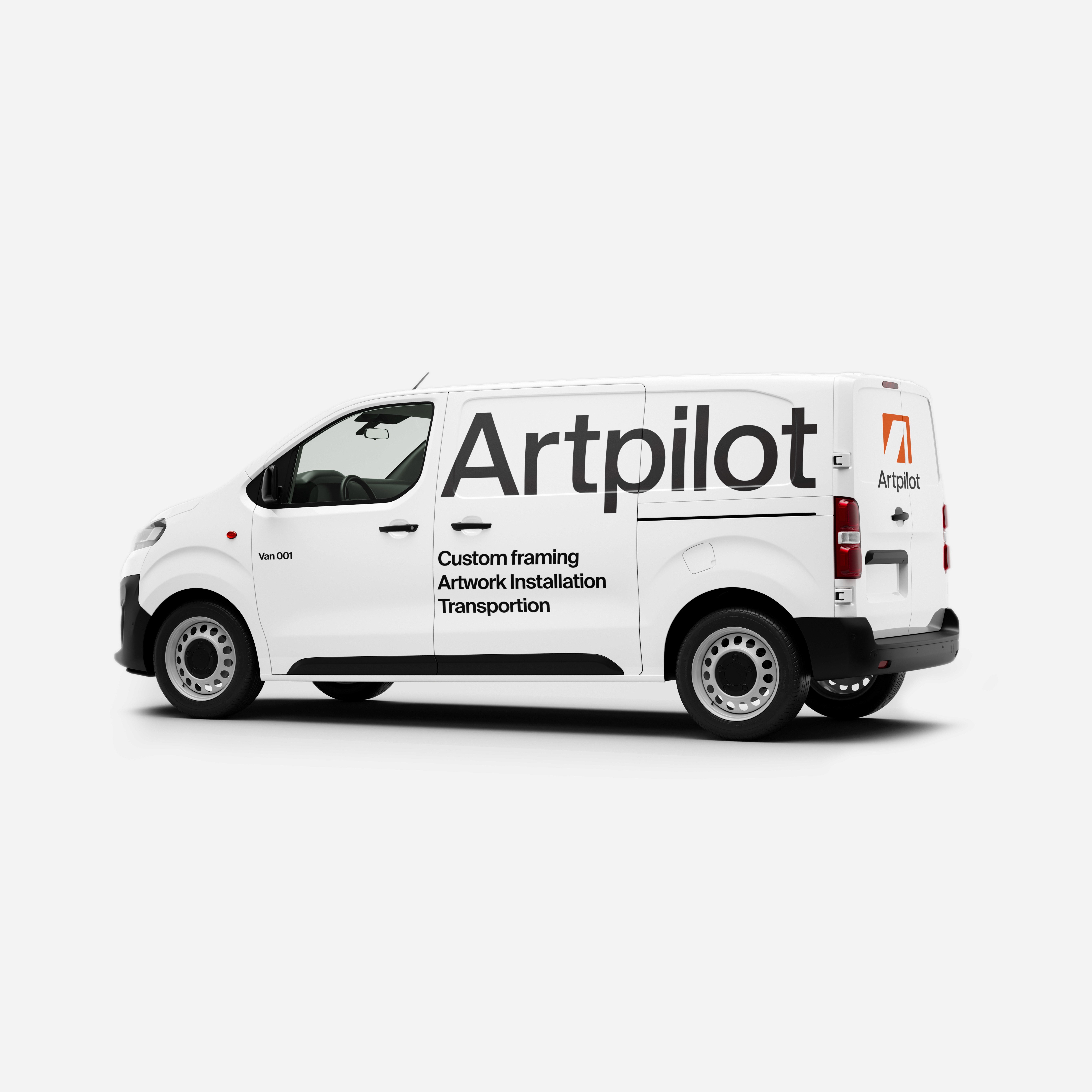
Fig. 11. A mockup of a delivery van that would be used by technicians on site.
5.2
The logo
The wordmark prioritises clarity and restraint. Rounded details convey friendliness, while a simplified monogram scales to small contexts. The logo is designed to sit comfortably in quiet, editorial layouts and on bold stencils on crates and shipments.
12.
13.
14.
15.
Fig. 5. Screenshot (used with permission) of a moderated usability study in which a participant shared their experiences on how the language in the app impacted their ability to place an order.
Fig. 6. Wireframes used to test a highly structured flow that lead the user through the process, progressively onboarding them as the order progressed.
Fig. 7. A Google form used to unmoderated usability testing that allowed for participants from 3 continents to provide feedback.
Fig. 8. A presentation deck prepared to present to stakeholders identifying and prioritizing findings and sharing actionable insights.
5.3
Applications
16.

Fig. 13.
17.


18.
19.


20.
21.

22.
Fig. 16. Mockup of an large billboard.
Fig. 17. Example imagery to be used in advertisting content
Fig. 18. Hats and uniforms showcasing the wordmark and logo.
Fig. 19. Mockup of freight containers used for artwork transportation.
Fig. 20. Mockup of the mockup clients would revcieve before purchase in consults using the platform
Fig. 21. Branded email mockups
Fig. 22. Branded stencils on crates
1
Prototypes and mockups
6
Prototypes & mockups
6.1
1. App loading from iOS home
Flow: iOS home → loading animation → app home.
This clip demonstrates the loading animation and non‑content states as the mobile app launches. Because the home page relies heavily on artwork images, a two‑step progress sequence reassures users during longer load times.
6.2
2. Viewing a completed order
Flow: App home → completed → order.
Shows the mobile app navigating to a previous order. A re‑order button and thumbnail of the previously framed artwork make it easy to place a similar order again.
6.3
3. Accessing via browser
Flow: Browser logged‑out home → login → loading animations → browser logged‑in home.
Depict login and non‑content states leading to the browser home page. Adapting mobile layouts to a responsive web experience allows users to manage orders on desktop; larger screens make it easier to view multiple orders simultaneously.
6.4
4. Placing an order with the app
Flow: App home → new order → (forms and confirmations).
Show the streamlined mobile ordering process. Autofill fields and concise summaries reduce complexity; only relevant details are shown, and most answers are pre‑populated. Users mainly confirm each step, which feels like interacting with an in‑store sales associate and keeps cognitive load low.
6.5
5. Placing an order in the browser
Flow: App home → new order → browser‑based ordering flow.
Illustrate the desktop ordering experience. Reusing components and standardising typography, spacing and colour ensured a cohesive experience across devices, making it easier to adapt the design to new contexts.
1
Accessibility considerations
7
Accessibility considerations
7.1
Considering ability from the start
– Headings follow a simple, linear hierarchy; no skipped levels.
– Clear, descriptive link text (avoid “Click here” or bare numbers).
– Minimum 44 × 44 px tap targets; focus states are visible and consistent.
– Form labels are explicit; helper text explains why we ask for a field.
– Error messages use plain language and provide a next step.
– Motion is subtle and non-blocking; no essential information is conveyed by motion alone.
– Colour contrast meets or exceeds WCAG AA; do not rely on colour alone to signal state.
– Alt-text patterns prioritise purpose and unique visual information; decorative images are marked decorative.
7.2
Screen readers and contrast ratios
The design uses high‑contrast text by default, and alt text and semantic headings are documented in the design system to aid screen‑reader navigation. Typographic guidelines informed line spacing and character sizes, and icons are always paired with labels and given appropriate accessibility tags.
Fig. 5. Screenshot (used with permission) of a moderated usability study in which a participant shared their experiences on how the language in the app impacted their ability to place an order.
1
Learning and insights
8
Learning and insights
8.1
Impact of the project
– Reduced ambiguity by standardising service names, “What’s included,” and early scoping questions.
– Increased confidence through visible order status, clear timelines, and predictable actions.
– Created a reusable system of tokens and components that speeds future work and ensures consistency.
8.2
What I learned
– Language is a design material; swapping jargon for task-oriented labels meaningfully changes behaviour.
– A small set of high-leverage questions early in the flow prevents costly back-and-forth later.
– Designing for people who book on behalf of others surfaces edge cases that improve the experience for everyone.