Case studies / Artpilot
\UX/UI & Branding


Artpilot: Streamlining Art Services Through Human-Centred Design

Greg McCarthy | Posted: August 3rd, 2025
Last updated: August 3rd
Section 1
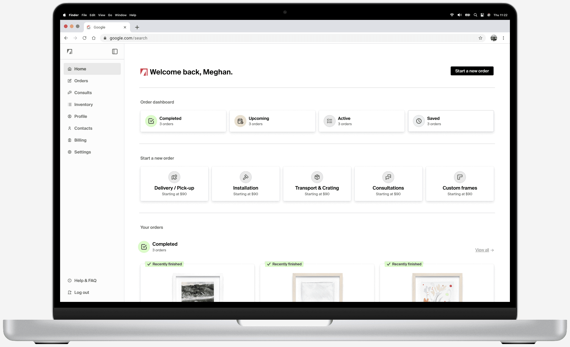
Project overview
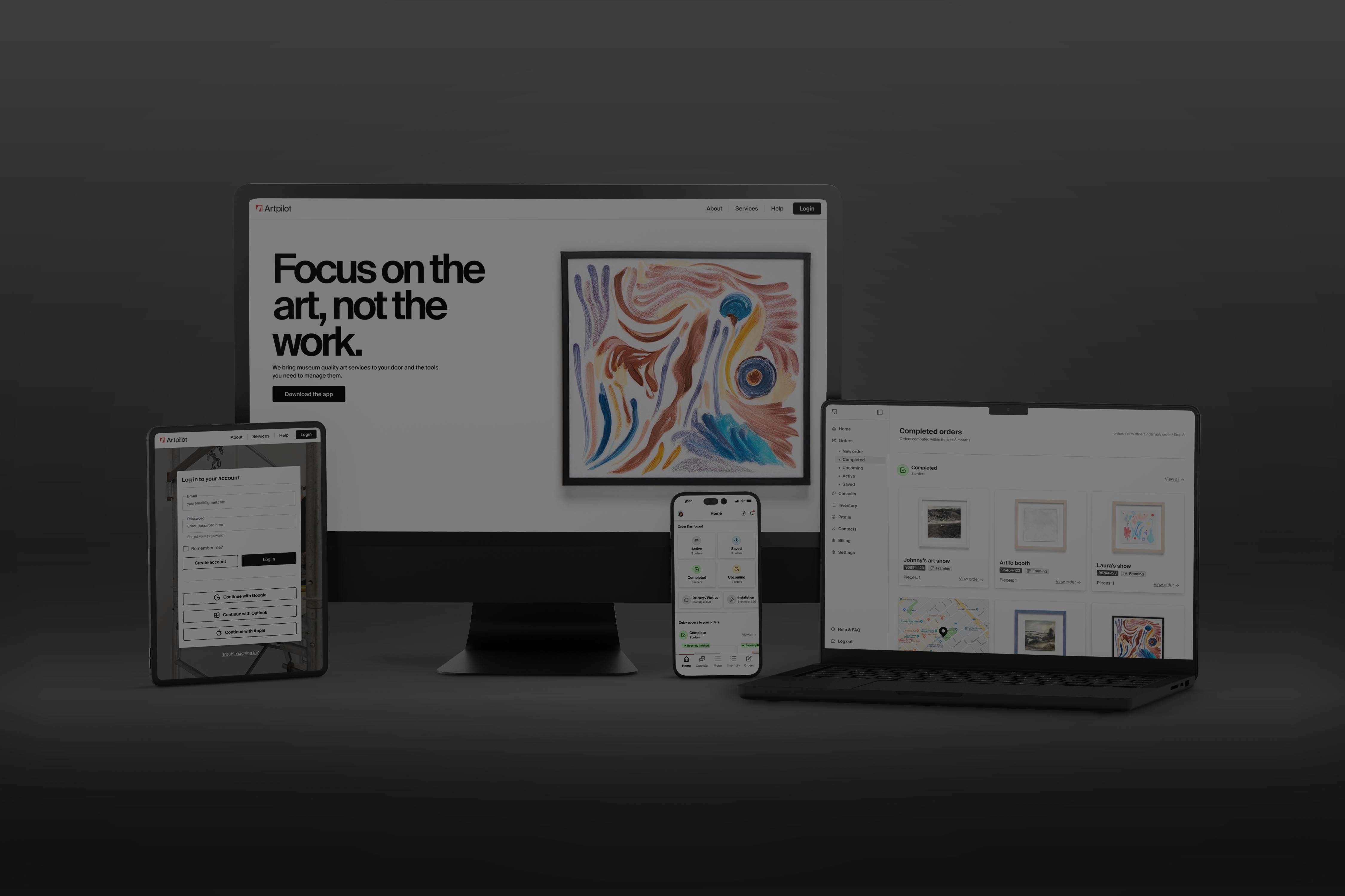
The product
Artpilot is envisioned as a digital platform that bridges the gap between people who own art and the specialists who care for it.

Video of the Artpilot mobile app prototype being opened from the iOS home screen.
Project duration
The project ran for six weeks during the summer of 2025. This relatively short timeline required rapid iteration and close collaboration with stakeholders.
The problem
Research revealed that the art‑services market relies heavily on manual processes. Scheduling and purchasing are often handled via email or phone, leading to booking errors, confusion around pricing and delays in service. These factors undermine trust and make it difficult to coordinate complex workflows. A digital solution needed to streamline bookings, clarify costs and reduce the risk of miscommunication.
Goals & objectives
The objective of the project was to design a service that builds and streamlines workflows for both clients and providers while strengthening trust. The proposed solution integrates scheduling, consultation requests and service bookings into a single interface. By reducing friction and uncertainty, Artpilot aims to boost user confidence and lower barriers to entry.
Role and responsibilities
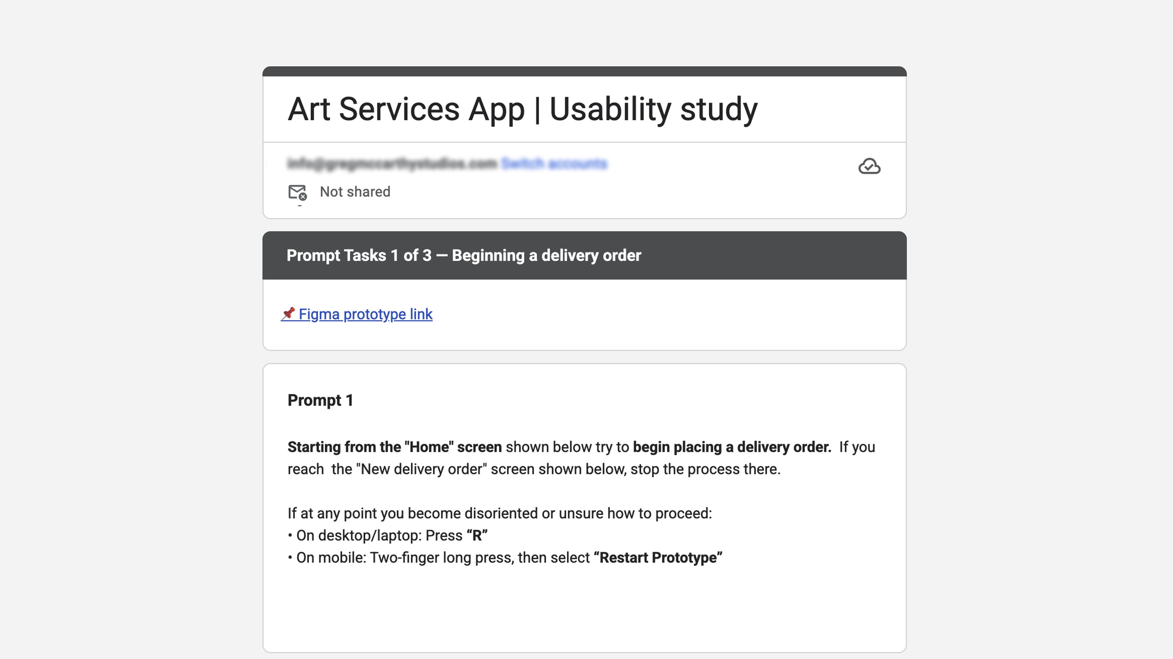
Lead UX designer and researcher. Responsibilities included conducting competitive audits, developing user personas, creating prototypes, running usability tests and iterating on designs based on feedback.
Key challenges
Reducing intimidation – Many users find art‑related services intimidating and confusing. The design needed to demystify the process and make it approachable.
Building trust – Because users often have strong emotional and financial attachments to their artwork, the interface had to communicate reliability and security.
Accommodating diverse user groups – Target audiences include artists, collectors, dealers/advisors, collections managers and homeowners. Each group has different priorities and workflows, so the design needed to be flexible.
Supporting novices and experts – First‑time users needed clear explanations of services without alienating experienced professionals.
Section 2
User research
Summary
Moderated interviews were held with a diverse group of stakeholders to understand their needs, behaviours and pain points around booking art services. Initially it was assumed only minor UX improvements were required; however, discussions uncovered deeper issues including multi‑party coordination, a lack of trust when booking remotely, ambiguous scopes of work and entrenched email/PDF workflows

Empathy maps made in Miro based on the 5 personas developed during the discovery phase.
Primary user groups
Research identified five distinct user groups:
Artists – those who produce art and often need framing, transport or installation services.
Collectors – private individuals who own artwork and require professional care.
Art dealers and advisors – intermediaries who arrange services on behalf of clients and manage sales.
Collections managers – professionals responsible for large private or institutional collections.
Homeowners/renters – people commissioning installations for their living spaces.
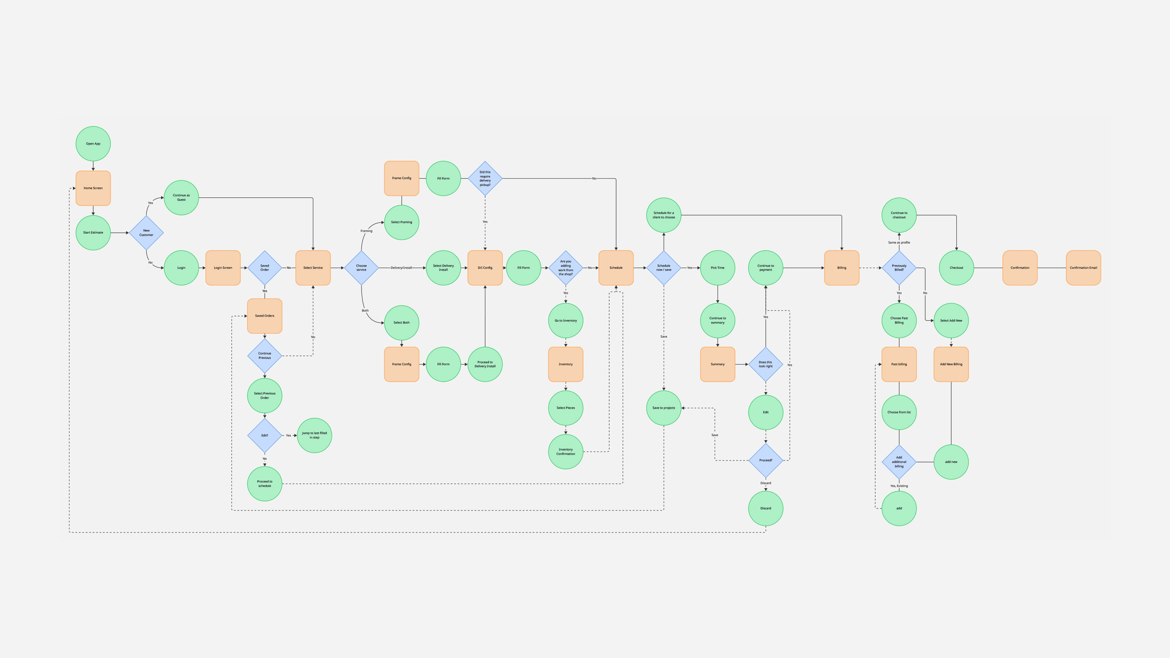
User flow diagrams were made to understand possible flows and user needs
Identifying pain points
To empathize with users, I created empathy maps and journey maps. Maintaining low visual fidelity at this stage helped them iterate quickly and focus on problem‑framing rather than aesthetics. These activities exposed key pain points: unclear processes, inconsistent pricing, poor coordination among parties and low trust in remote service providers.
User flow diagrams were made to understand possible flows and user needs
Section 3
Early stages
Low and medium fidelity designs
Paper wireframes and low‑fidelity prototypes allowed the team to explore multiple concepts and gather feedback early. Testing was front‑loaded so that the structure and flow of the product could be validated before investing in polished visuals. As fidelity increased, more representative content and terminology were introduced to ensure that industry‑specific language was understood.
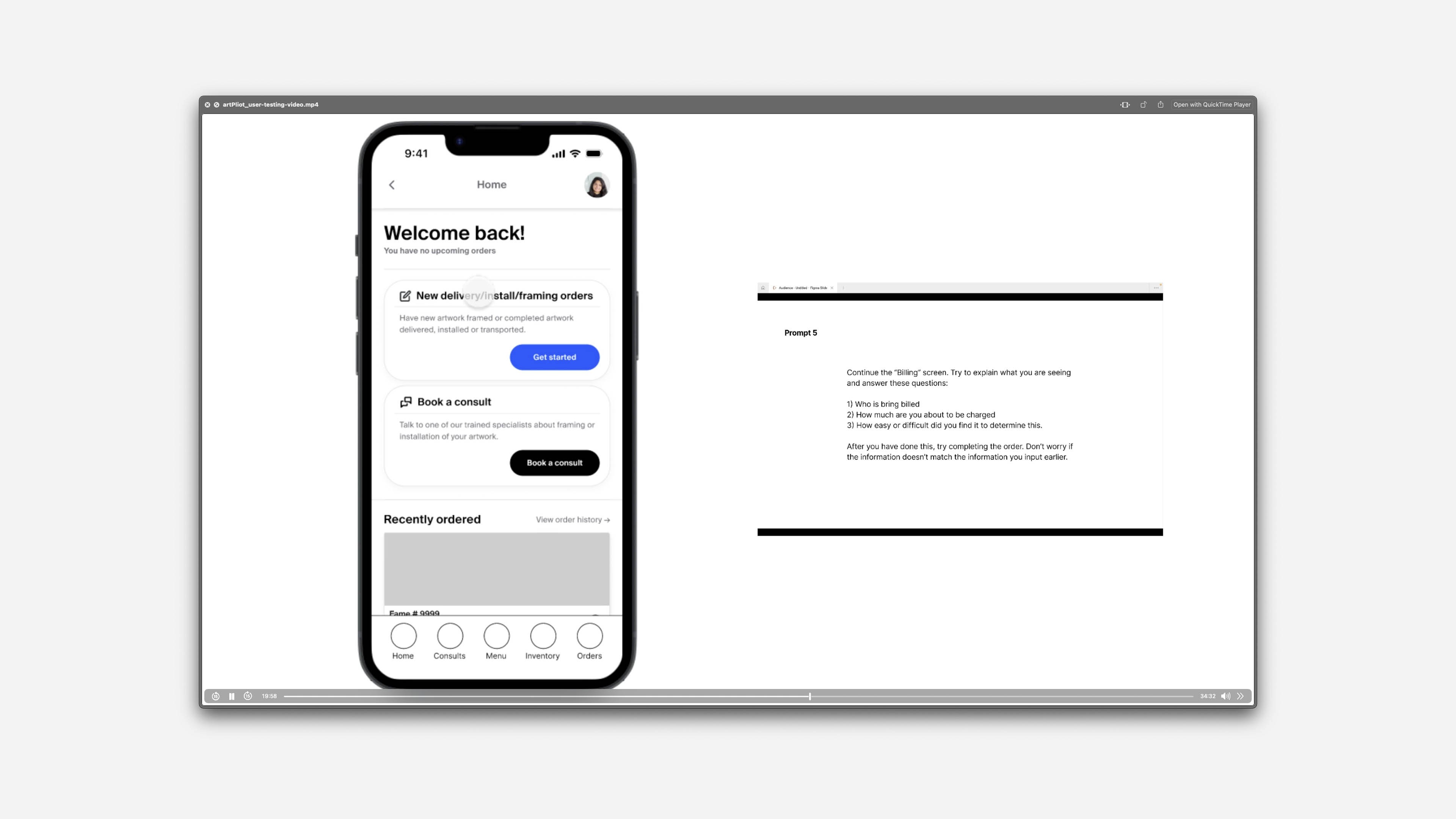

Testing & insights
Two rounds of usability testing produced actionable insights. In the first round, participants appreciated supportive but non‑patronizing language and preferred a familiar shopping‑style flow over a conversational “in‑store” approach. Guided flows accelerated order placement, bottom navigation was more intuitive than top tabs and users did not value pre‑packaged options on the home screen. The second round, measured with a System Usability Scale (SUS) score of 78, emphasized clearer navigation, simplified ordering steps, refined language and the removal of unnecessary error recovery optionsgregmccarthystudios.com. Notably, 80 % of respondents followed the prescribed flow in unmoderated studies.
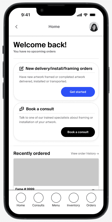

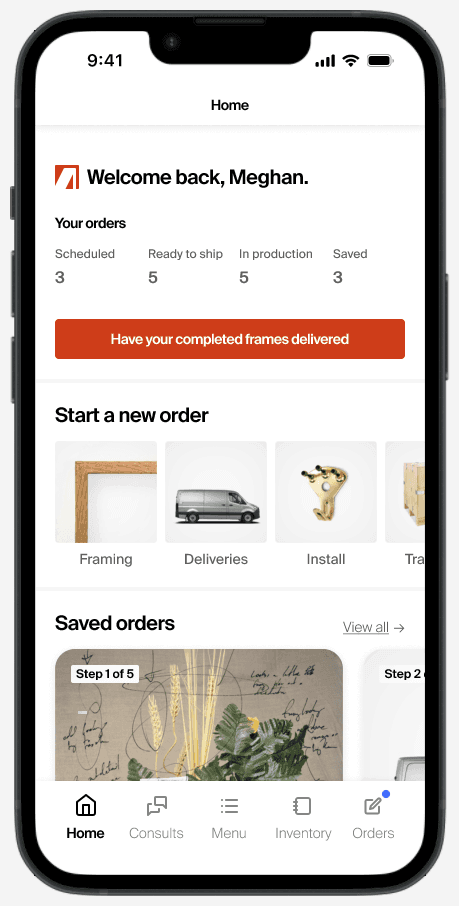
Different versions of the home screen that were tested throughout the process.
Section 4
Refining the design
Responsive adjustments
As the project progressed to responsive web design, the design system was updated to support varying screen sizes. Icon sizes were standardized and layouts were adjusted to ensure the interface remained usable on both mobile and desktop.
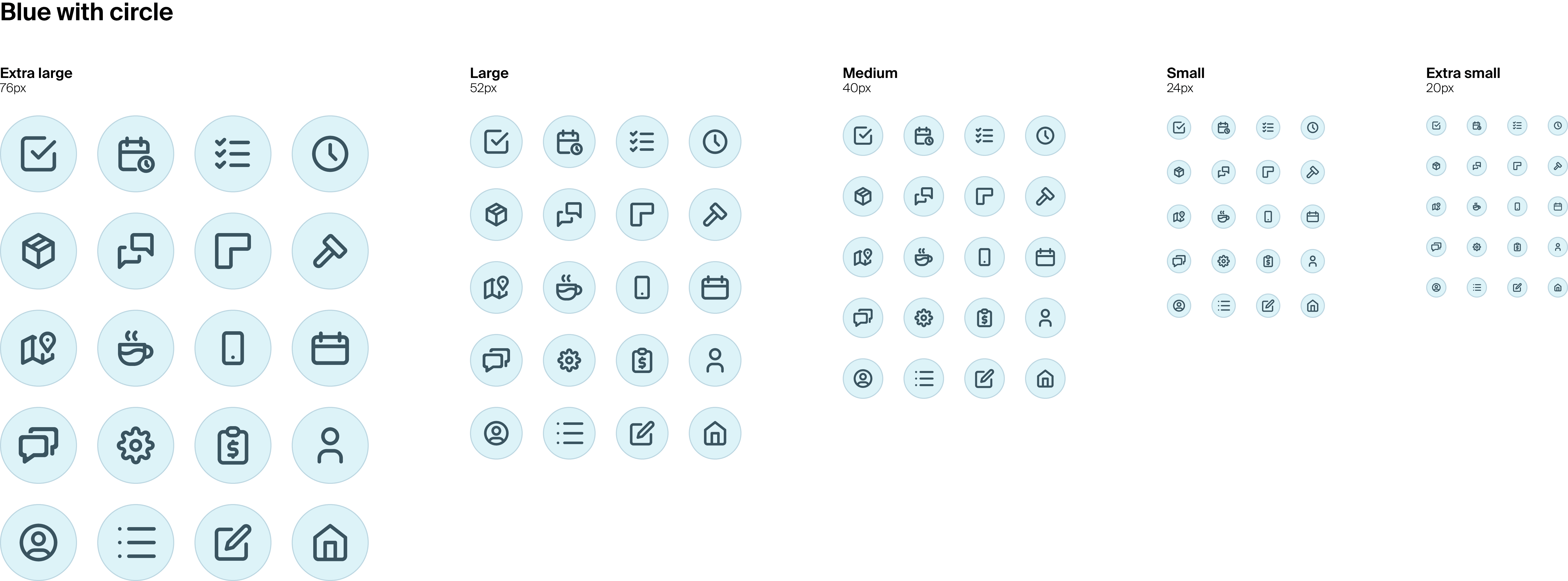
A section of a sticker sheet made with icon sizes to allow for scaling of components.
Developing the design system
Working with an atomic‑design inspired strategy, I defined interaction states and component variations to support scalability and modularity. This systematic approach helped maintain across platforms while allowing individual elements to be reused or adapted. Components derived from Material Design were modified to align with Artpilot’s branding, and screens were tested at various breakpoints to verify responsive behaviour.
Section 5
Brand identity
The brand identity
The brand needed to balance responsibility and trust with creativity. A restrained palette of greys combined with red and office‑supply‑inspired pastels conveys the crispness of gallery spaces, while pops of red suggest fragile stickers and industrial signage. The chosen sans‑serif typeface, with its high x‑height and traditional structure, feels inviting yet professional.
The logo
Artpilot’s logo depicts the corner of a picture frame, forming the letter A in negative space. The single‑colour mark is designed for versatility – it can be stencilled onto crates, printed on fragile‑item stickers and reproduced clearly as a favicon or app. Keeping the logo flat and within the sRGB colour space ensures consistent reproduction across media.

The stack logo showing safe zones
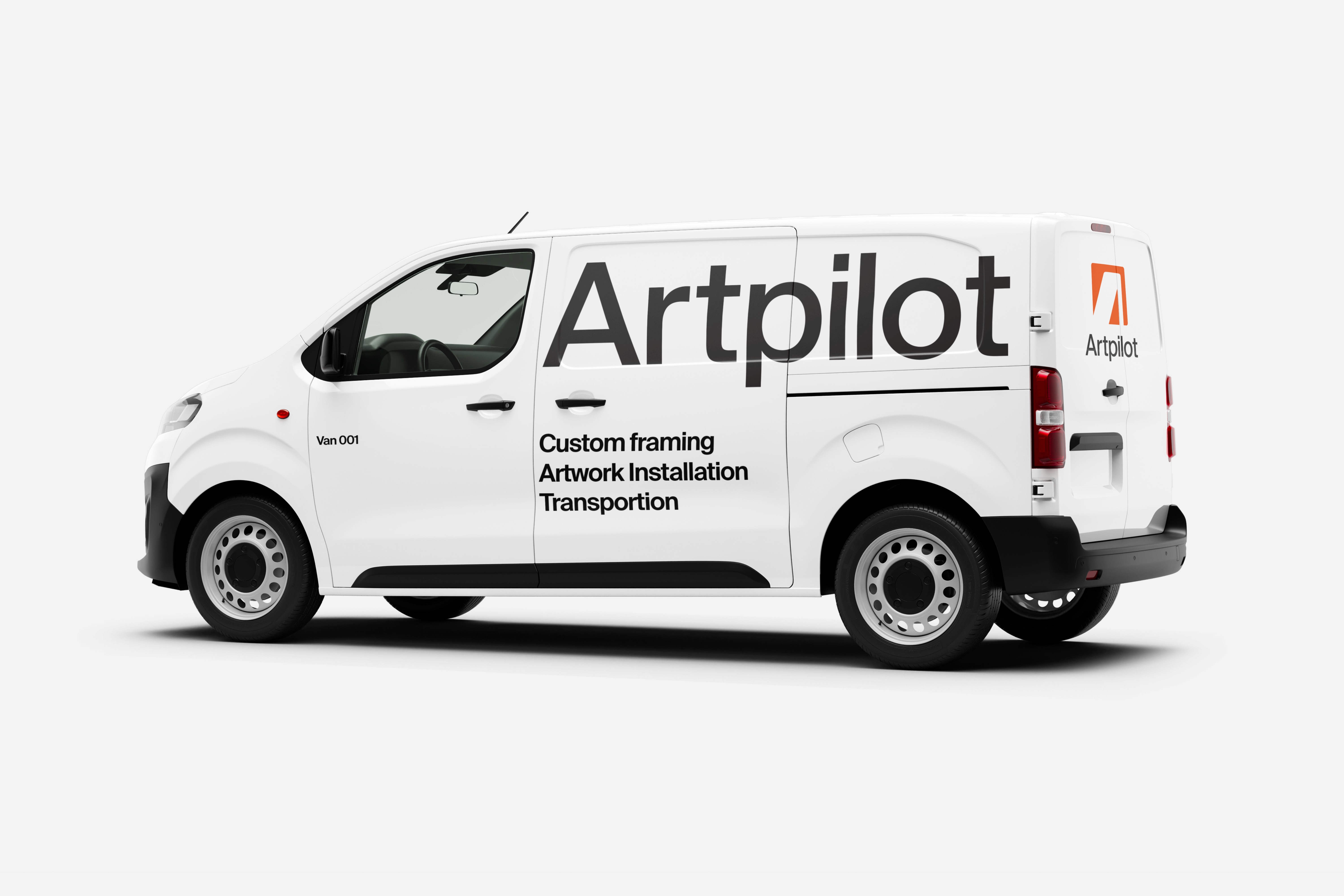
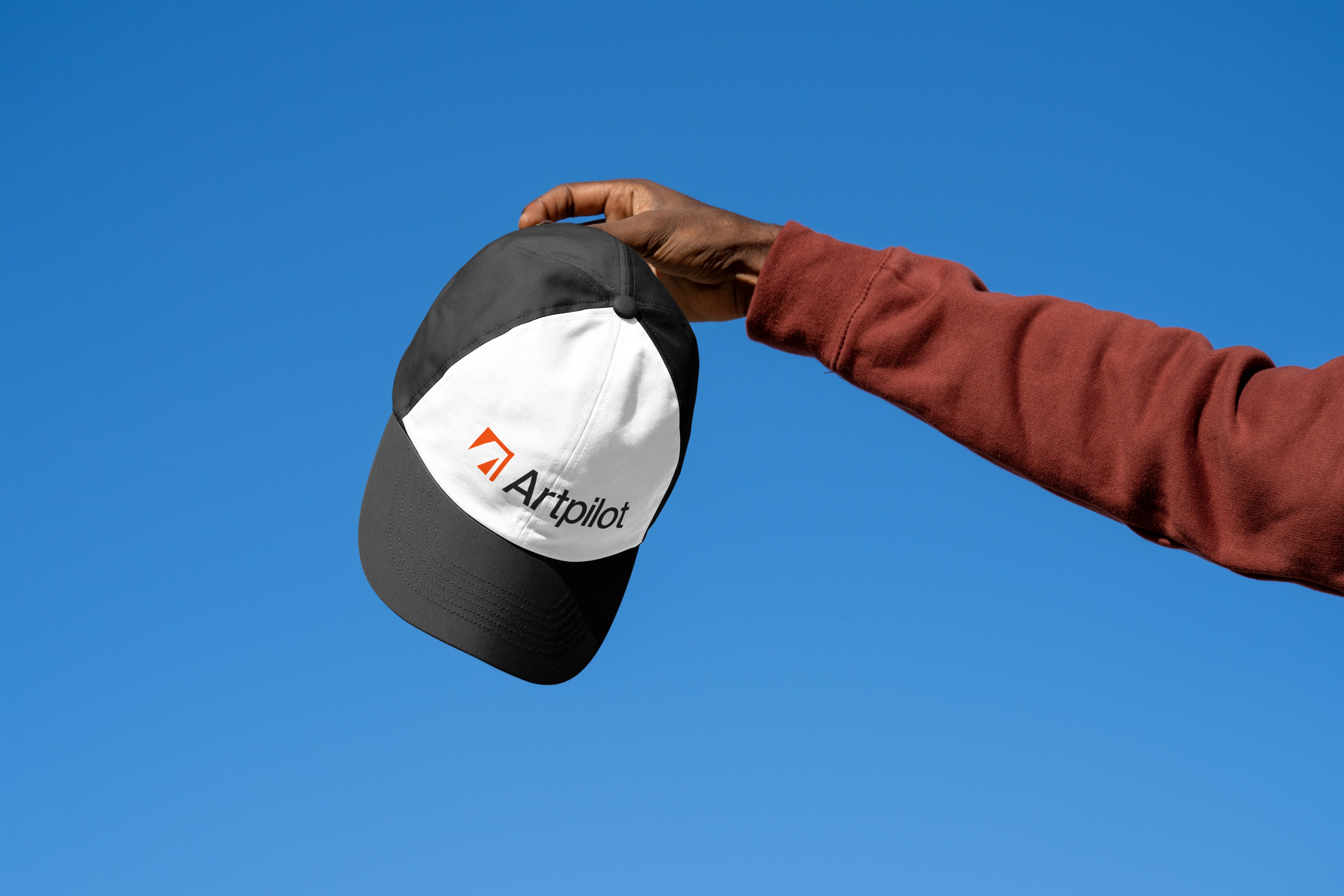
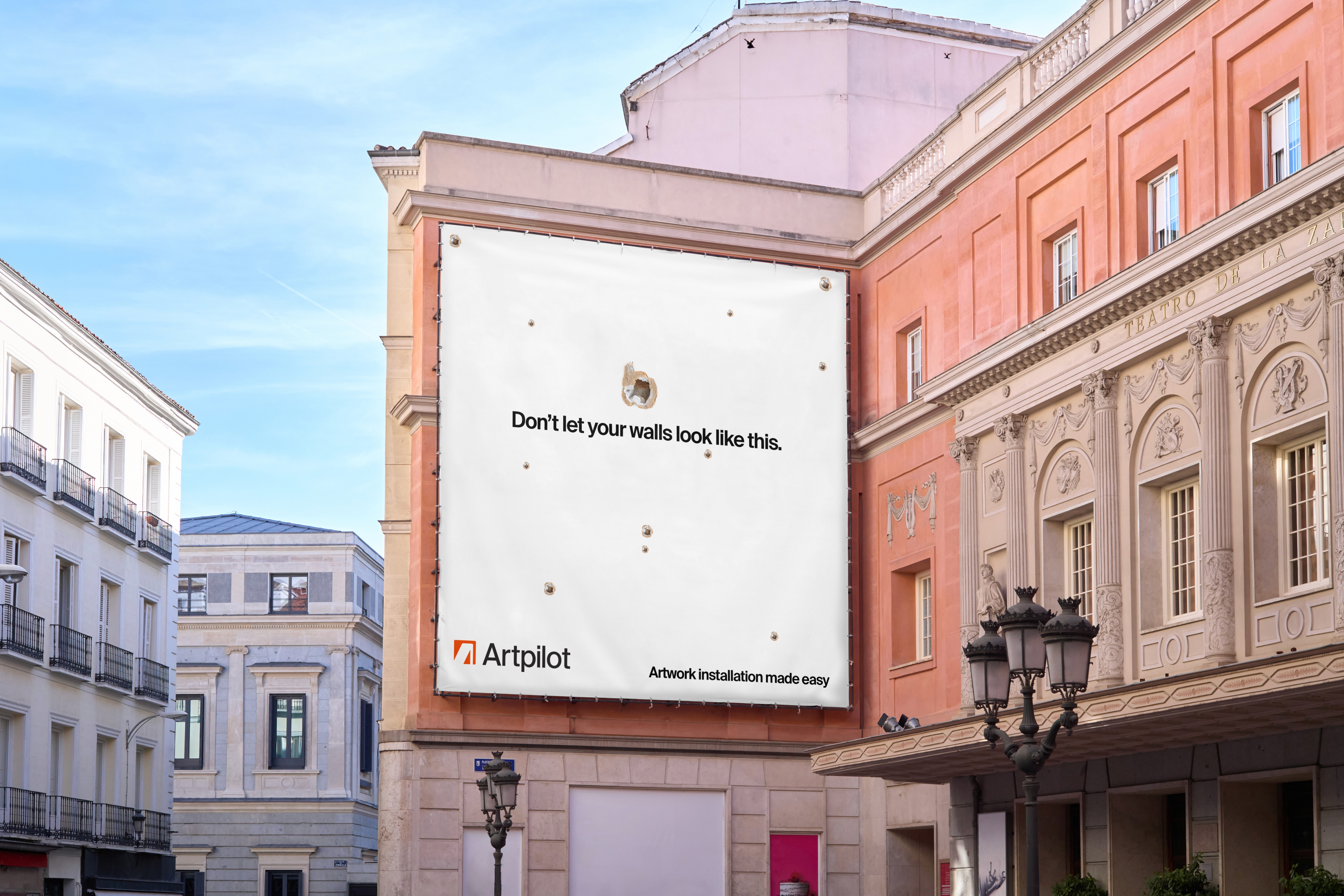
Branding mockups
To visualize how the brand might appear in the real world, several mockups were produced. These include a delivery van decorated with the Artpilot logo and service descriptors, a branded cap for uniforms, a billboard advertisement and swatches showing the colour palette with corresponding hex codes. A typographic poster highlights the chosen typefaces—Suisse Int’l, Suisse Works and Suisse Mono—and notes their support for Latin, Cyrillic and Arabic alphabets
Sticker red
#DB3334
Flat grey
#2D2D2D
Hard black
#000000
Office Green
#DB3334
Office blue
#DDF3F8
Office orange
#FFF2CE
Light grey
#EBEBEB
Barely grey
#F3F3F3
White
#FFFFFF
Section 6
Prototype & mockups
Selected flows
High‑fidelity prototypes were built for both mobile and desktop to capture key user journeys, from sign‑in and onboarding to browsing orders, placing new orders and checking statuses. These prototypes demonstrate how the refined design system delivers consistent interactions regardless of device
1. App loading from iOS home
Flow: iOS home page > loading animation > app home

Video of the loading animation and non-content states leading to the home screen on the mobile app prototype.
A video shows the loading animation and non‑content states of the mobile app launching from the iOS home. Because the home page relies heavily on artwork images, it needs extra time to load. A two‑step progress sequence reassures users that the app is working, which is particularly important for people with slower data connections.
2. Viewing a completed order
Flow: app home > completed > order

Video of a the mobile app prototype navigating through a path to a previous order.
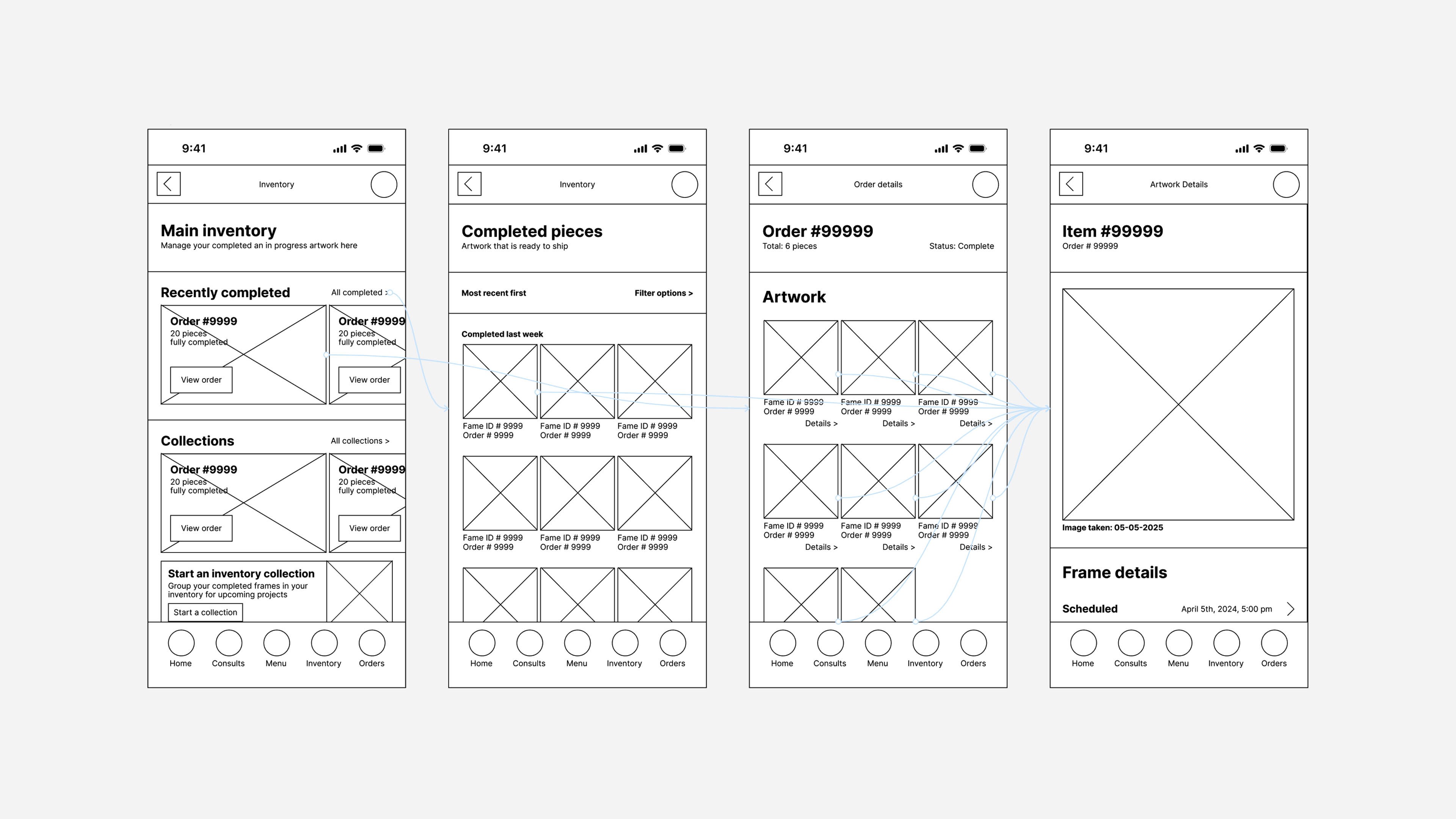
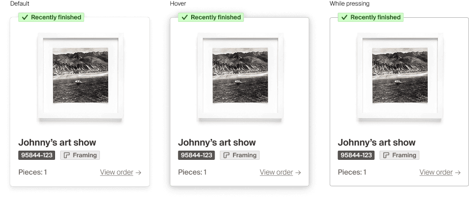
Interviews revealed that customers often reorder similar frames. To support this behaviour, the completed‑order flow includes a re‑order button and a thumbnail of the previously framed artwork. This combination makes it easy to locate past orders and reduces the effort of placing a new order with identical options.
3. Accessing via browser
Flow: browser logged out home > login page > loading animations > browser logged in home

Login and non-content states leading to home page of the browser version of the product
Enterprise clients reported a preference for placing and managing orders on desktop. In response, the mobile layouts were adapted into a responsive browser experience. The information architecture was adjusted slightly so that a public‑facing site could wrap around the authenticated ordering environment, delivering the same functionality in a desktop context. Larger screens also allow users to view more orders at once—an advantage for teams handling high volumes.
4. Placing an order with the app
Flow: app home > new order >
Login and non-content states leading to home page of the browser version of the product
The mobile ordering process was streamlined to be as simple as possible. Autofill fields and concise summaries reduce complexity and allow users to skim information quickly. Orders can involve many variables, so the app displays details only when necessary and pre‑populates most answers. Usability tests showed that this approach feels like interacting with an in‑store sales associate: users mainly confirm each step rather than navigating extensive menus. This deliberate use of autofills and confirmations minimizes cognitive load and keeps the process quick.
5. Placing an order in the browser
Flow: app home > new order >
Login and non-content states leading to home page of the browser version of the product
Recognizing that many enterprise customers work from a desktop environment, flows were prototyped on both mobile and desktop. Reusing components and formalizing variables such as typography, spacing systems and colour ensured a cohesive experience across. Establishing these standards early made it easier to adapt the design to new contexts later.
Section 7
Accessibility considerations
Considering ability from the start
Inclusivity was a guiding principle from the outset. Personas and user stories considered users who may not be able to move or install their own artwork due to mental or physical challenges. Features that enable caregivers to book services on someone else’s behalf were incorporated, allowing clients to stay informed while delegating the logistics.
Screen readers and contrast ratios
High‑contrast text was used as a default, and the design system documented alt text for images and semantic headings to aid screen‑reader navigation. Best‑practice typographic guidelines informed decisions about line spacing and character sizes. Wherever possible, icons were paired with labels and given appropriate accessibility tags.

Caption explaining the image
Section 8
Takeaways
Impact of the project
Digitizing art services has the potential to transform a largely analogue sector. Many art‑services companies are small and lack bespoke digital tools. Artpilot could provide a white‑label solution for existing providers or enable a single firm to scale its offerings. With minor modifications, the product might serve as a turnkey platform for businesses providing framing, installation, transport and related services.
What I learned
The project strengthened skills in responsive design, usability testing and presentation. A deliberate reliance on low‑cost, low‑fidelity prototypes in the early stages allowed the structure to be validated quickly and freed up time in the later stages for visual design and branding. Although this approach delayed the creation of high‑fidelity artefacts, it ultimately produced a higher‑quality product.
Artpilot demonstrates a commitment to accessibility and inclusion, learn more about our actions here.
Services
Artwork installation
Custom framing
Transportation and crating
Pricing
Company
About us
Our story
Careers
Contact
Who it’s for
Artists
Cultural institutions
Galleries
Corporate collections
Account
Login
Support
Forgot password
Close account