Home
Case studies
Photo
Art
DESIGN / ART PILOT / CASE STUDY
Artpilot: Streamlining Art Services Through Human-Centred Design


Client
Personal project
Time
6 weeks, 2025
Work
UX+UI design – Identity
Posted
August 6th
Last updated
August 6th
01
Case Study Summary
Artpilot is a six-week UX project aimed at digitizing the art-services sector. The goal was to replace ad-hoc email and phone bookings with a unified platform for scheduling, consultation and service management. Through user research, prototyping and iterative testing, I identified pain points, defined key user groups and developed a responsive design system. Usability testing achieved a System Usability Scale (SUS) score of 78, with 80% of unmoderated participants following the intended flow. The project underscores the importance of clear language, inclusive design and a modular design system for both novice and expert users.


02
02
Project overview
Problem statement
Art‑service transactions typically happen via email or phone, leading to booking errors, unclear pricing, coordination problems and low trust. These issues undermine complex projects. A digital solution was needed to simplify workflows and improve transparency.
Goals & objectives
Reduce intimidation: Make art services feel approachable.
Build trust: Convey reliability and security for high‑value artwork.
Accommodate diverse users: Cater to artists, collectors, dealers, collections managers and homeowners.
Support novices and experts: Provide clear guidance without alienating experienced users.
Role and responsibilities
Conducted competitive audits.
Developed user personas.
Created low‑ and high‑fidelity prototypes.
Ran moderated and unmoderated usability tests.
Iterated on designs based on feedback.
Key challenges
Build a service that simplifies workflows for clients and providers.
Integrate scheduling, consultation requests and service bookings in one interface.
Reduce friction and uncertainty to boost user confidence.
03
User research
Methods
I ran moderated interviews with a diverse group of stakeholders. Discussions uncovered coordination challenges, trust issues when booking remotely and reliance on email/PDF workflows.
Insights
Users wanted a single place to manage orders and clear communication about next steps.
Reassurance about provider credibility and care for sensitive artwork was critical.
04
Early stages
Low‑ and medium‑fidelity designs
Paper wireframes and low‑fidelity prototypes allowed rapid exploration and early feedback.
Medium‑fidelity prototypes validated terminology and procedures in moderated sessions.
Remote tests via Google Forms reached a wider audience.
Early stages
Testing & insights
Two rounds of usability testing generated actionable insights:
Participants preferred supportive language and a shopping‑style flow over an in‑store conversation.
Guided flows and bottom navigation accelerated order placement; pre‑packaged options were not valued.
The second round achieved a SUS score of 78. Clearer navigation, simplified steps and refined language were key improvements.
In unmoderated studies, 80 % of respondents followed the prescribed flow.
05
Refining the design
Responsive adjustments
I updated the design system to support various screen sizes. Icons were standardized and layouts adjusted for usability on both mobile and desktop.
Refining the design
Developing the design system
Using an atomic‑design approach, I defined interaction states and component variations. Modified Material Design components aligned with Artpilot’s brand. Responsive testing ensured consistency across devices.
Key refinements
Interaction states for artwork cards and other components.
Branded variations of Material Design components.
Responsive screens tested at multiple breakpoints.
07
Brand identity
Visuals
A restrained palette of greys with accents of red and pastel tones balances responsibility and creativity. The primary typeface (Suisse Int'l), a sans‑serif with a high x‑height, feels inviting yet professional.
Brand identity
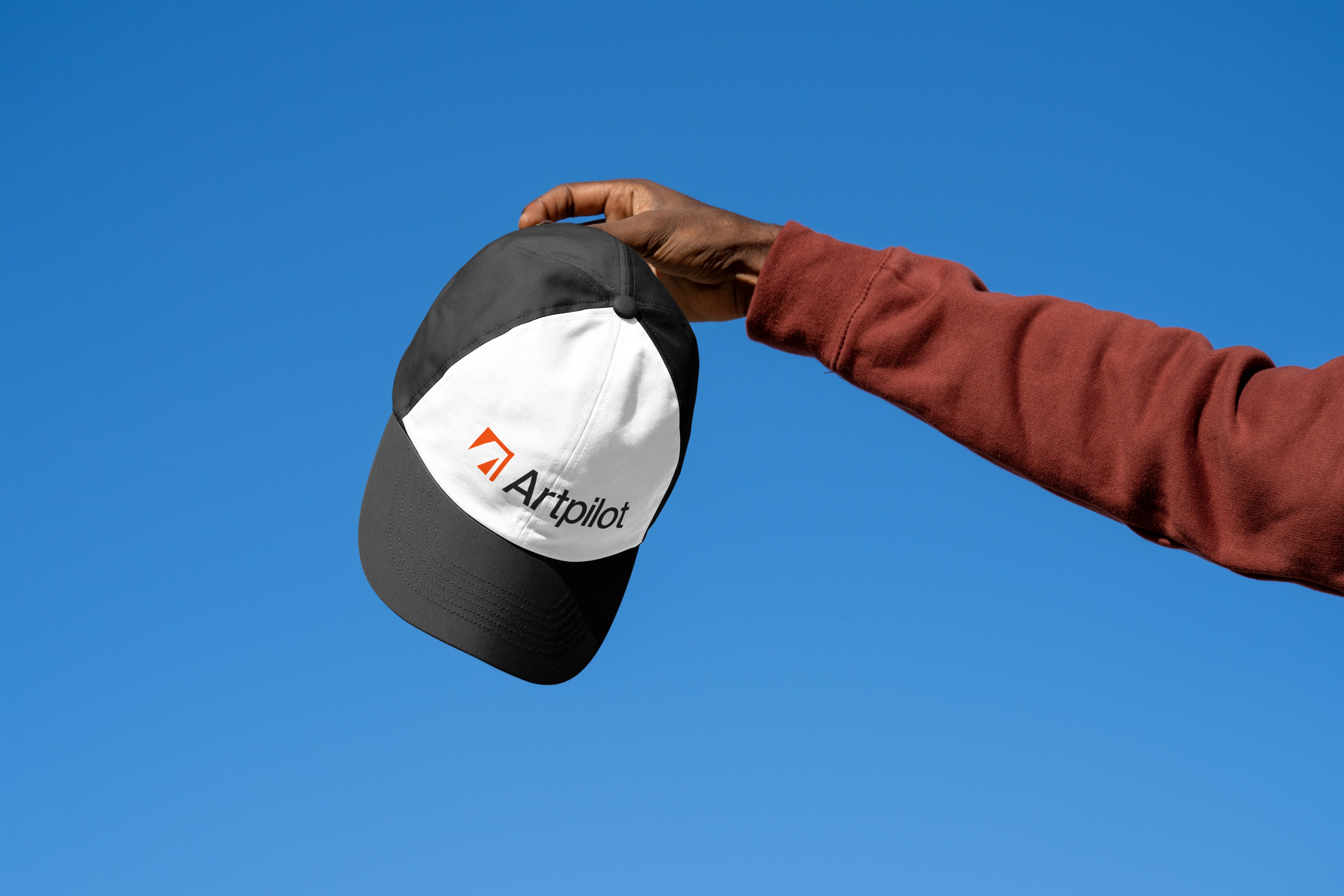
The logo
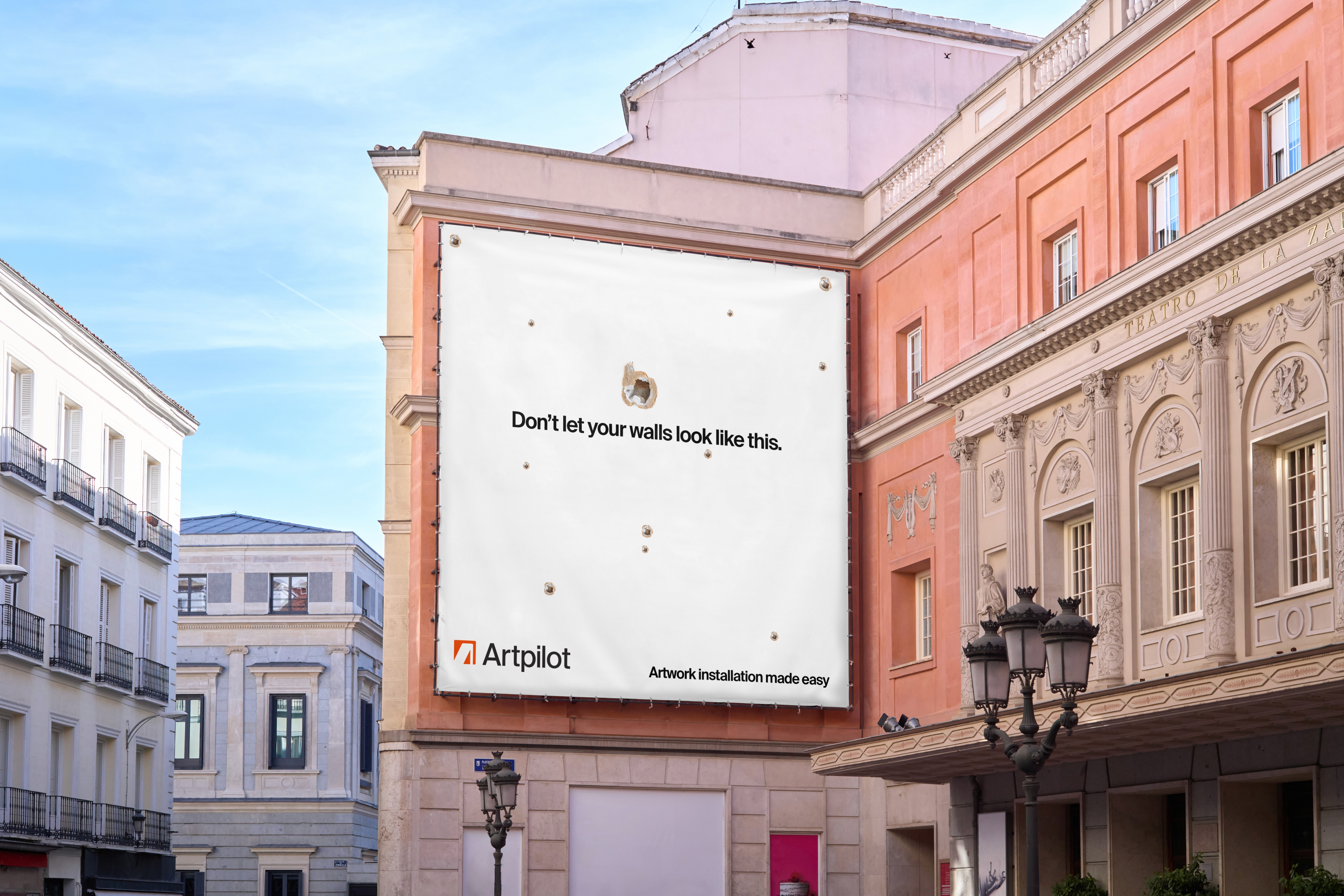
The logo shows the corner of a picture frame forming the letter “A” in negative space. Its single‑colour design works well on crates, fragile stickers and digital icons.
Brand identity
Considerations
The logo is easily reproduced in single colour printing processes for tape, stencils and other packing materials.
Easily scalable to favicon/app icon size
Language support for Latin, Cyrillic and Arabic alphabets to ensure a greater number of artwork names and user information can be typeset within brand guidelines.
08
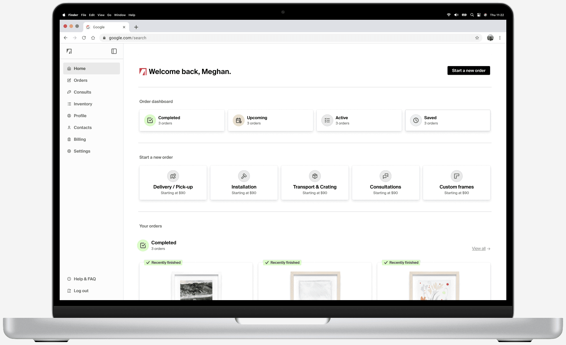
Prototype & mockups
Selected flows
High‑fidelity prototypes for mobile and desktop illustrate key user journeys. Shared components, typography and spacing create a cohesive experience across devices.
1. App loading from iOS home
A video shows the loading animation and non‑content states of the mobile app launching from the iOS home. Because the home page relies heavily on artwork images, it needs extra time to load. A two‑step progress sequence reassures users that the app is working, which is particularly important for people with slower data connections.
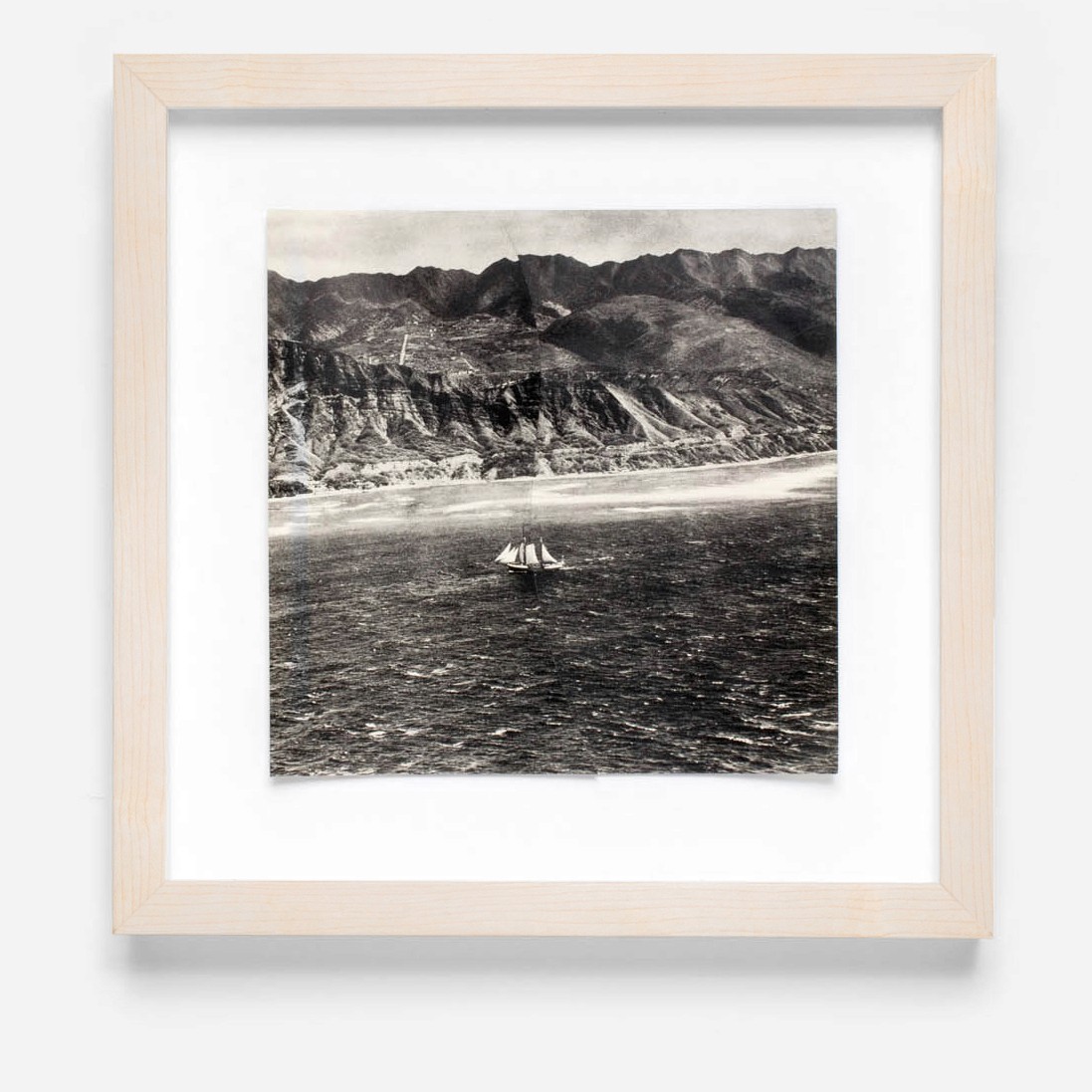
2. Viewing a completed order
Interviews revealed that customers often reorder similar frames. To support this behaviour, the completed‑order flow includes a re‑order button and a thumbnail of the previously framed artwork. This combination makes it easy to locate past orders and reduces the effort of placing a new order with identical options.
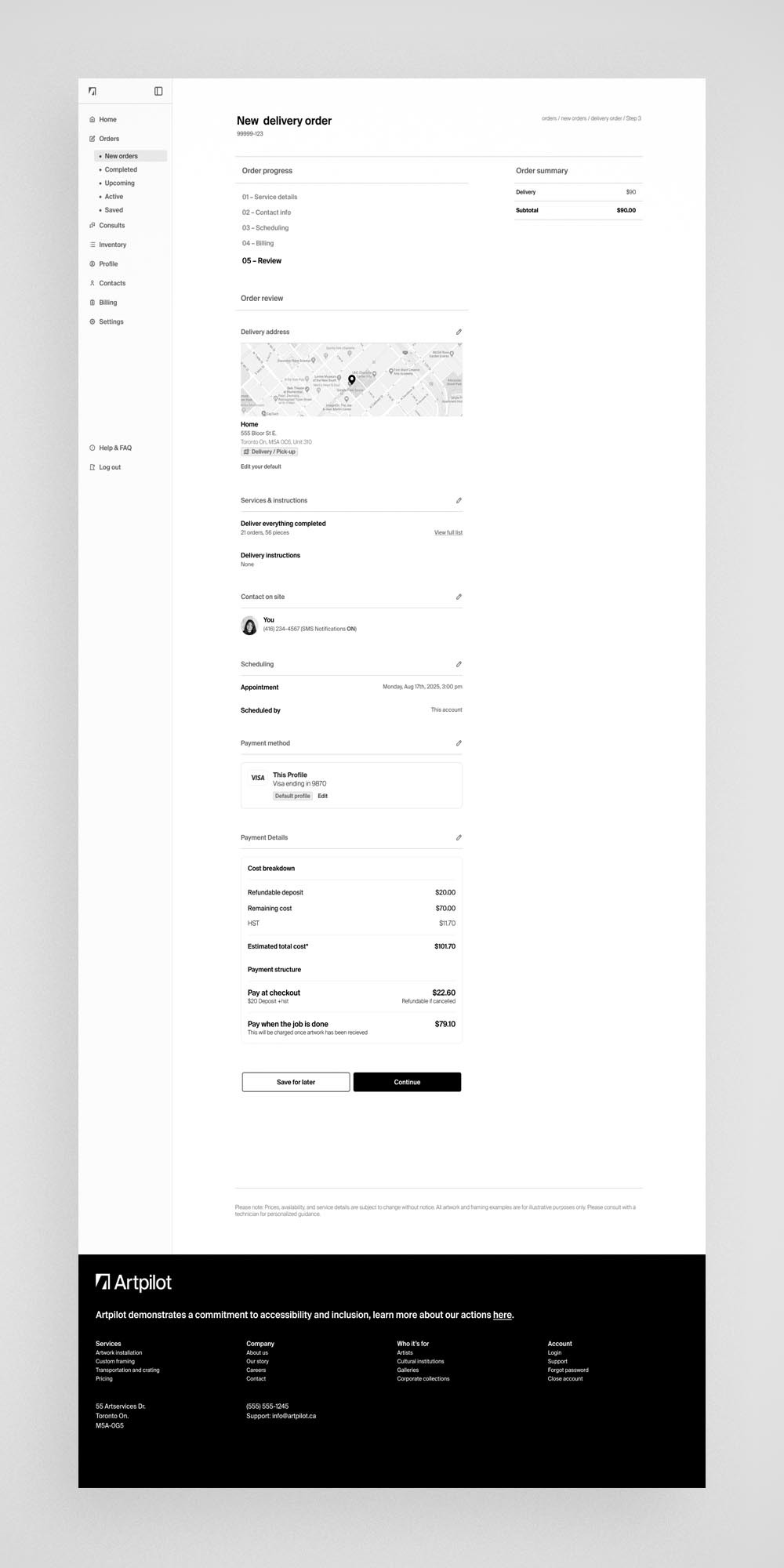
3. Accessing via browser
Enterprise clients reported a preference for placing and managing orders on desktop. In response, the mobile layouts were adapted into a responsive browser experience. The information architecture was adjusted slightly so that a public‑facing site could wrap around the authenticated ordering environment, delivering the same functionality in a desktop context. Larger screens also allow users to view more orders at once—an advantage for teams handling high volumes.
4. Placing an order with the app
The mobile ordering process was streamlined to be as simple as possible. Autofill fields and concise summaries reduce complexity and allow users to skim information quickly. Orders can involve many variables, so the app displays details only when necessary and pre‑populates most answers. Usability tests showed that this approach feels like interacting with an in‑store sales associate: users mainly confirm each step rather than navigating extensive menus. This deliberate use of autofills and confirmations minimizes cognitive load and keeps the process quick.
Section 7 of 8
Accessibility considerations
Considering ability from the start
Inclusivity informed every phase of the project. Features allowing caregivers to book services on behalf of clients address users who cannot move or install artwork themselves.
Accessibility practices:
High‑contrast text and semantic headings support screen‑reader navigation.
Icons are paired with labels and given appropriate accessibility tags.
Clear typography and adequate line spacing improve readability.
Videos include transcripts and captions so users who cannot view them can still access the information.
Alt text is concise (one to two sentences) and focused on the image’s purpose.
Plain language avoids jargon, and acronyms are expanded on first use.
Section 7 of 8
Takeaways
Impact of the project
Digitizing art services can transform a sector that relies on manual processes. Artpilot could be offered as a white‑label solution or enable firms to scale their offerings. With minor adjustments, the platform could support framing, installation, transport and related services.
What I learned
Responsive systems save time. Building a design system early ensures consistency across devices.Low‑fidelity testing pays off. Validating structure and language before polishing visuals results in higher‑quality products.Inclusivity benefits everyone. Inclusive design reduces friction and makes complex workflows approachable for both novices and expert
DESIGN / ART PILOT / CASE STUDY
Greg McCarthy
Case studies
Artpilot
Trail Sections
Signal Chain
Navigating Spaces
Toronto Image Works
Photo
Imaging & retouching
Capture
Art
Projects
Artist CV
Get in touch
info@gregmccarthystudios.com