Semaphor
The Semaphor Branding Proposal focuses on designing a brand centered around hand-powered emergency communication solutions emphasizing community resilience and reliability by combining tradition and innovation.
Spring 2023 | Greg McCarthy
Project Summary
Introduction
The Semaphor Branding Proposal outlines the development of a brand dedicated to providing hand-powered emergency communication solutions.The project aims to ensure connectivity during crises, combining tradition and innovation to create reliable and versatile products.
Brand Mission Statement
To give peace of mind during emergencies by providing hand-powered communication solutions.
Brand Purpose
We create hand-powered emergency communication devices that give back to communities while connecting our customers when they need it most.
Vector Partnership
VECTOR (Vancouver Emergency Community Telecommunications Organization) enhances community resilience during emergencies by developing communication capabilities through volunteer efforts. Semaphor partners with VECTOR to support this mission.
Product Description
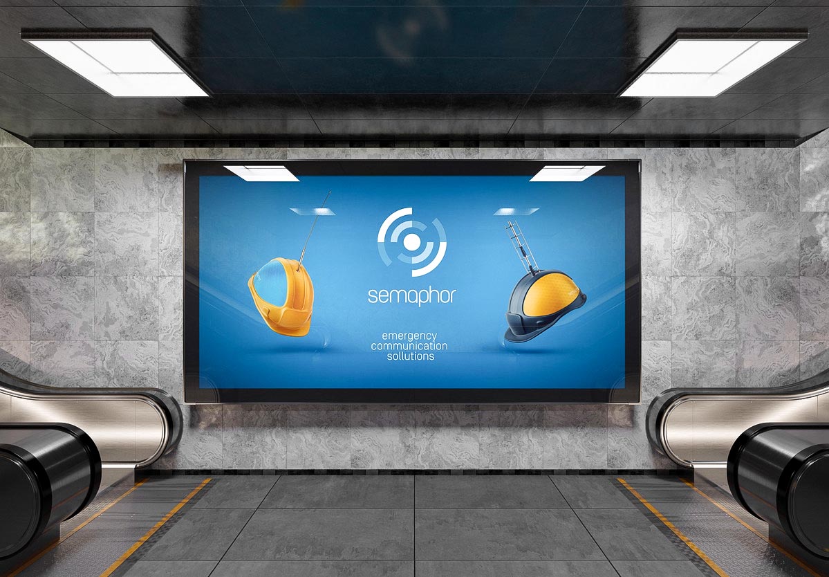
Semaphor products combine hand-crank radios, satellite phones, lights, and USB charging systems to ensure continuous communication during crises.The Pro model includes a satellite network subscription and a donation to VECTOR. The HWY-1 model provides essential features without the satellite subscription and includes a one-time donation to VECTOR.

This image displays a mockup of the dependency tracking screen. Users can add or remove dependencies, which are then tracked by the clock. The display shows the 5 most frequently used dependencies in the "On Display/Recent" menu, with the history shown below. The dependencies chosen to be tracked by the application will be displayed as oscillating circles on the main display.
Visual Identity
The Logo
Inspired by satellites, the logo features a logotype and icon composed of concentric rings, bringing to mind Wifi connectivity, space exploration, radio towers, and bullseyes. The negative space creates a satellite between the wifi symbols, and the rings emanate from a central circle like radio waves from an antenna.

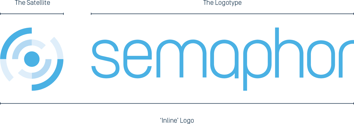
The Semaphor logo consists of two components: the 'Satellite'(shown below) and the 'Logotype.'(shown after) These can be arranged in a 'Stack' or 'Inline' formation, or the logotype can be displayed individually.
Color Palette
Striking a balance between calming and invigorating, this palette merges natural blues with a warm orange to evoke open skies, sunlight, and outdoor preparedness. The result is a versatile range of color combinations that remains visually cohesive.
Semaphor Sky
Hex: #76c4f2
RGB: (118, 196, 242)
Semaphor Cloud
Hex: #c1e3f9
RGB: (193, 227, 249)
Semaphor Snow
Hex: #e2ecf8
RGB: (226, 236, 248)
Semaphor Dawn
Hex: #ffa200
RGB: (255, 162, 0)
Semaphor Midnight
Hex: #002c40
RGB: (0, 44, 64)
The Full Document
The complete Semaphor brand guidelines are available upon request. This comprehensive document covers:
Logo usage/misuse
Color palettes
Typography
Pattern construction
Real-world brand applications (advertising and packaging)
A in-depth competitor analysis
Design rationales
Mockups
In addition to other elements. If you would like to see a copy of the full document, please do not hesitate to reach out and a .pdf can be provided upon request.
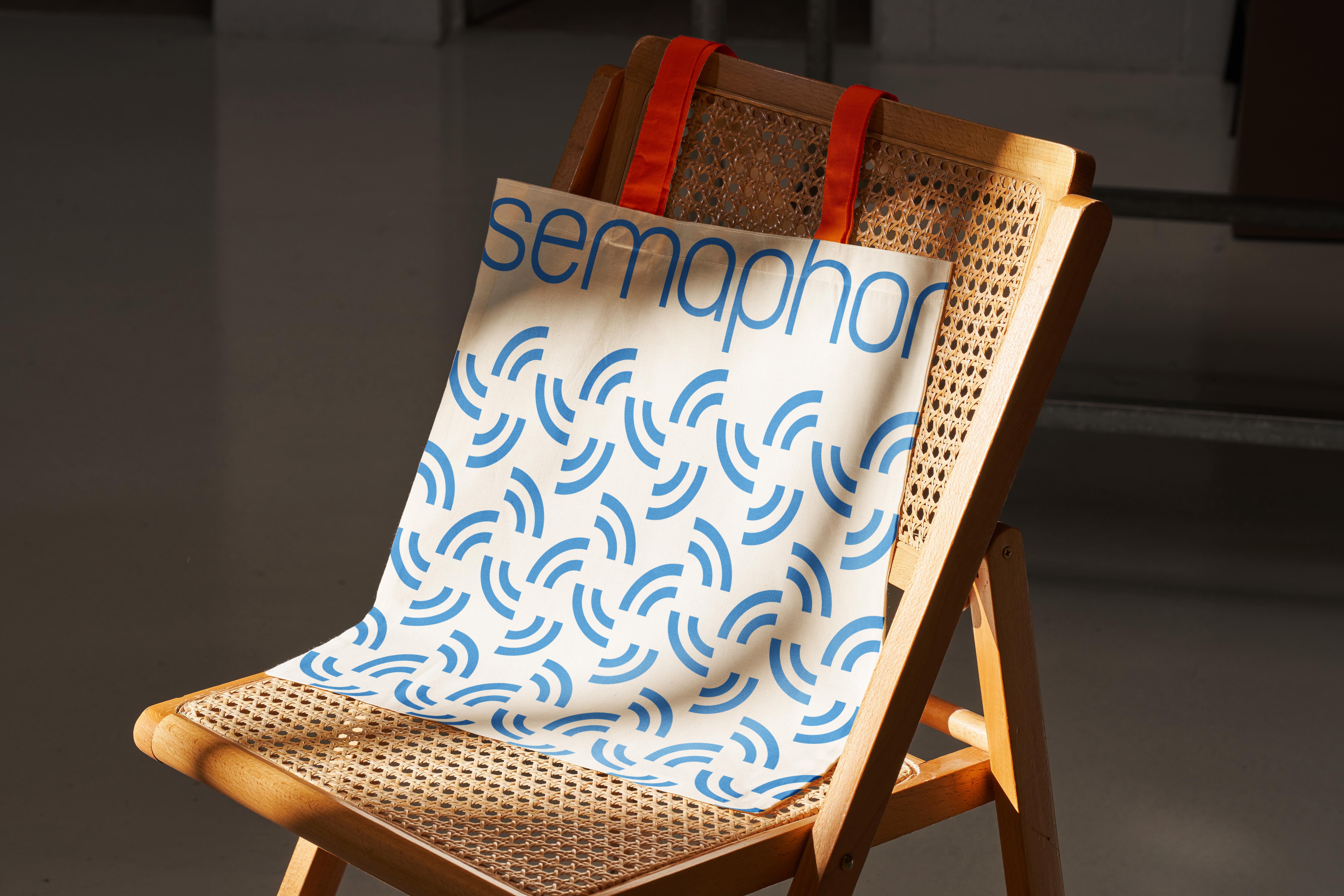
Mockups


For additional information or to discuss this project further, feel free to reach out via the contact info on the about page. Your feedback and inquiries are always welcome!
All content Copyright Greg McCarthy © All rights reserved.