Trail Sections
Developed at OCADU, this prototype uses data visualization to enhance and map the experience of Toronto’s Lower Don Valley Trail users.
Winter, 2024 | Greg McCarthy
Project Summary
Introduction
This project explores visualizing qualitative data from user-uploaded photos combined with Strava map information to enhance trail users' situational awareness. By reflecting the unique experiences and landscapes of the Lower Don Valley Trail, it introduces a mobile-first interface that organizes and highlights key elements, allowing for quick information digestion and seamless re-engagement with the trail experience.
Objective
To design a solution that organizes user-uploaded data and map information into a digestible, visually appealing format that enhances the trail experience while preserving users' focus on nature.
Problem Statement
Trail users often feel overwhelmed by disorganized and disparate information sources, such as closures and wayfinding, when navigating the trail. Current solutions fail to balance informational value with usability, detracting from the natural experience. This project aims to create a streamlined, intuitive visualization tool to simplify navigation and enhance users' connection to the trail.

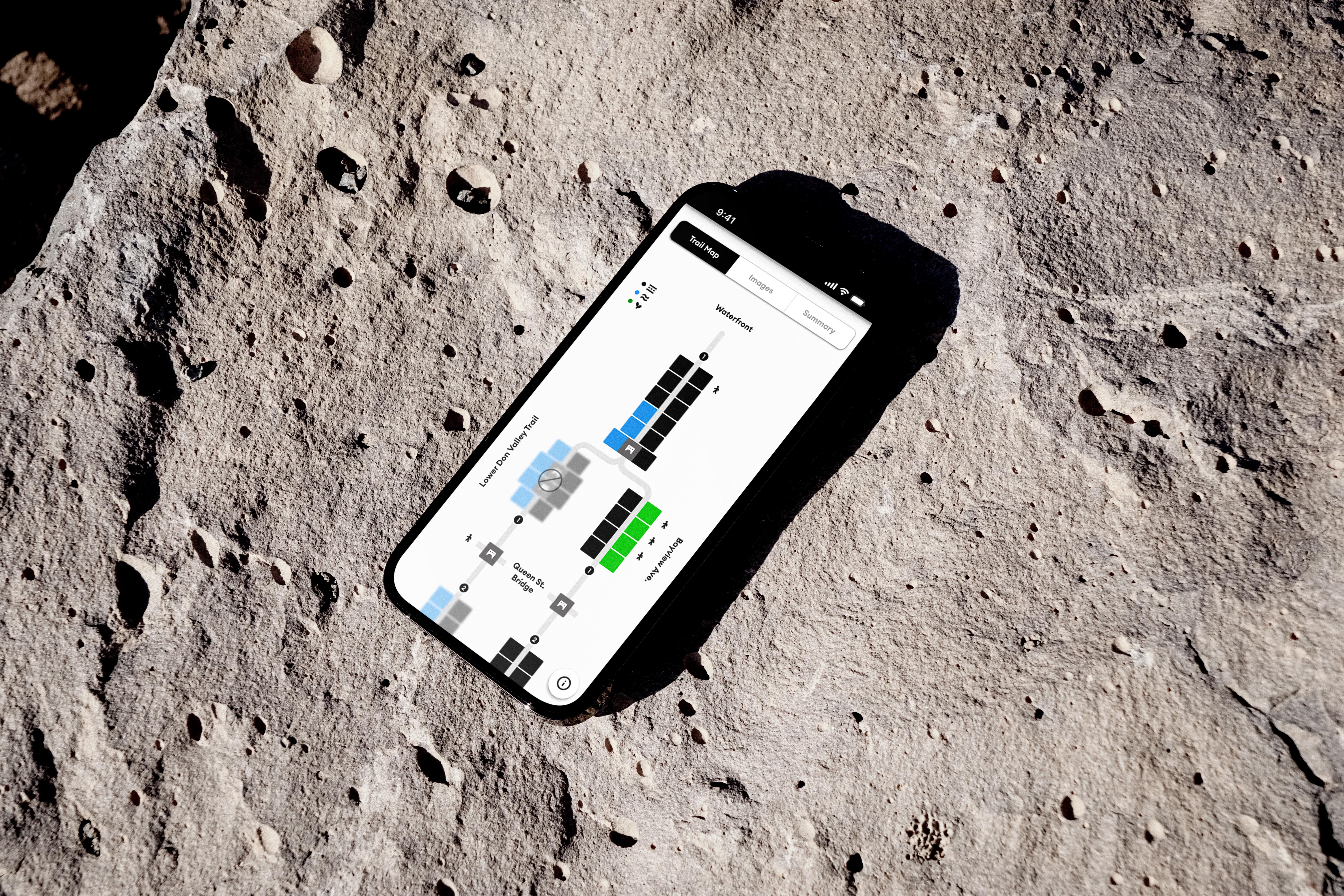
A mockup of the "Images" screen on the prototype is shown. It uses a modified network chart to plot the number of user uploaded images. This is done to communicate to the user the area of interest along the trail based on user interaction
Design Process
Research Methods
This project employed a research approach to ensure the visualization tools met real user needs and accurately reflected trail dynamics. Data from Strava and government sources, such as trail maps and closure updates, were synthesized in Miro to visually map connections and relationships. User-uploaded photos were coded and categorized, and insights from trail user interviews highlighted pain points and needs. Iterative testing refined the design for practical usability.
Key Methods
Data Collection: Collected data from Strava and government trail information to identify landmarks, access points, and usage patterns.
Mapping in Miro: Used Miro boards to visually map relationships between user activity and trail features.
User Interviews: Conducted interviews to identify common frustrations and preferences for better trail navigation.
Prototyping and Testing: Refined designs iteratively using feedback from sketches and prototypes, prioritizing clarity and simplicity.
Data Analysis and Sketching
Used open coding of Strava maps to define key data categories.
Grouped and visualized user-uploaded images by category.
Chunked data into manageable segments based on landmarks.
Created early Figma sketches to represent trail data linearly.
Tested low-fidelity visualizations to highlight key features of the data.

A linear trail visualization that maps various data points, highlighting key patterns and landmarks identified during the data analysis phase.
Project Stages
Discover
Conducted informal interviews to identify user needs and frustrations.
Collected and analyzed data to map key trail features.
Used open coding to categorize qualitative data and identify patterns.
Define
Synthesized insights to identify critical pain points and opportunities.
Created Miro boards to visually organize relationships between trail data and user activities.
Established a clear project focus on simplifying navigation and enhancing trail experiences.
Develop
Created low-fidelity sketches in Figma to visualize linear trail data.
Designed and tested v1 prototype to assess concept feasibility.
Feedback: Improve data clarity and reduce visual clutter.
Iterated v2 prototype based on testing feedback.
Improvements: Enhanced trail markers, simplified navigation, and refined visual hierarchy.
Deliver
Finalized v3 prototype with prioritized usability and key information.
Adjustments: Removed redundancies, streamlined design elements, and ensured in-situ functionality.
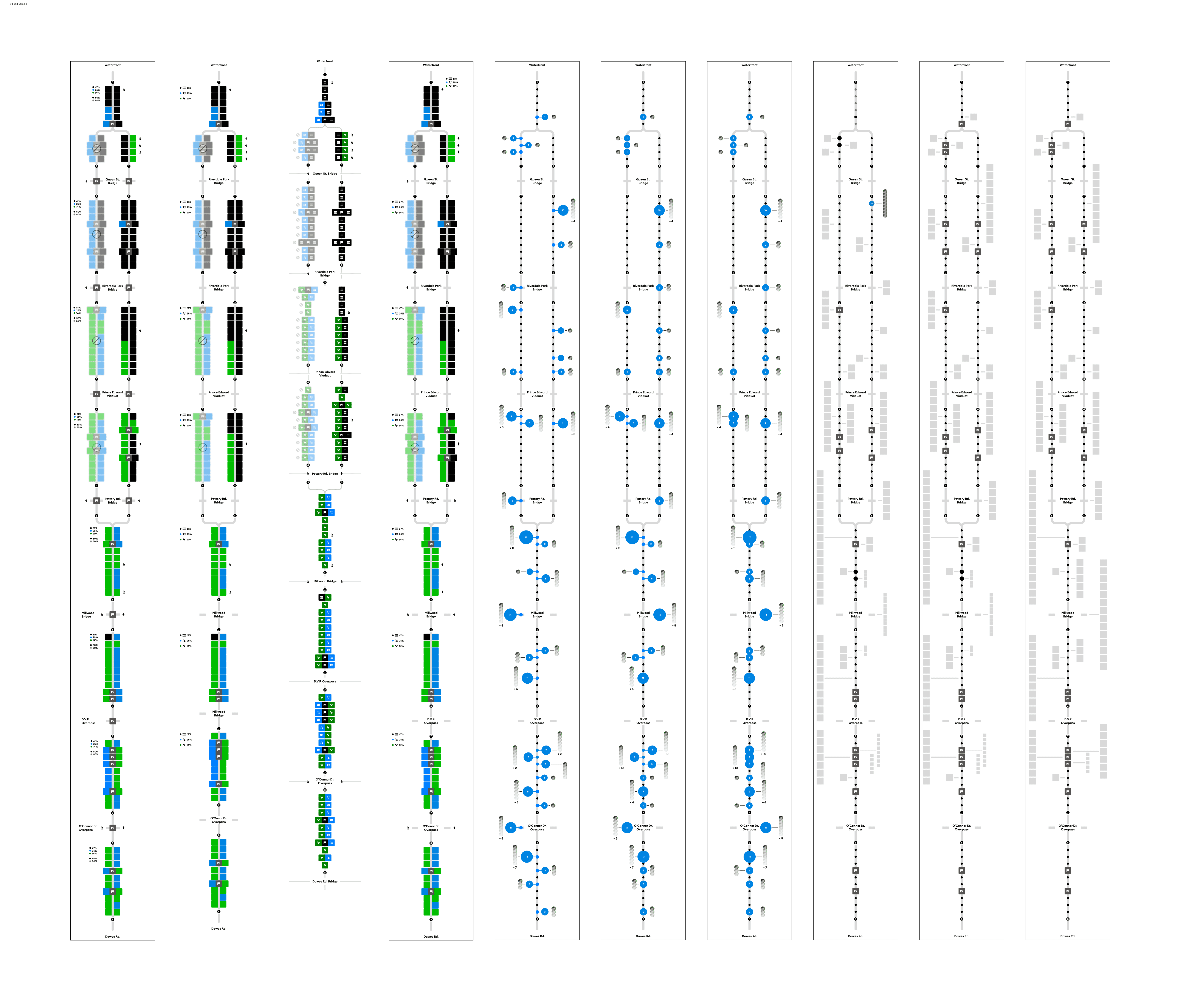
The initial design of 3 screens underwent significant revisions, which included a substantial reduction in visual elements, a reorganization of the information architecture to eliminate redundancies, and an emphasis on maintaining consistency across all screens. This screenshot illustrates an early iteration.
Outcomes
Current Version
This project currently functions well for this specific trail. However, it could be scaled to incorporate additional trails. This project offers a unique exploration into alternative urban trail wayfinding methods and demonstrates how data visualization can improve the experience of leisure activities.
Looking Forward
Should this project be revisited, I would dedicate more time to incorporating additional data sources into the dataset for a more comprehensive overview, while still maintaining brevity. Furthermore, I would explore incorporating multiple trails using the same structure, with modifications for specific landmarks. Alternatively, I could enable users to plot custom paths and merge datasets/visualizations, presenting interesting and compelling challenges.

The “About” screen from the onboarding user flow of the prototype.
For additional information or to discuss this project further, feel free to reach out via the contact info on the about page. Your feedback and inquiries are always welcome!
TL;DR
Why it matters: Trail users often struggle with disorganized navigation tools. This project leverages user-uploaded photos and Strava map data to enhance trail navigation and situational awareness, blending information with a natural experience.
The details:
A mobile-first visualization tool designed to simplify navigation along the Lower Don Valley Trail.
Synthesizes data from Strava, government maps, and user-uploaded images to highlight landmarks, closures, and activity hotspots.
Research included user interviews, iterative prototyping in Figma, and open coding of trail data for clarity and usability.
Prototypes evolved to focus on linear trail visualizations, prioritizing clarity, reduced clutter, and in-situ usability.
The takeaway: This project demonstrates how data visualization can improve urban trail navigation. With potential for scaling to additional trails or custom paths, it offers an innovative approach to blending leisure and technology.
All content Copyright Greg McCarthy © All rights reserved.